

Create_ · Season 0 · Episode 7
Developing The Brand
16 Mar 2025 · 47 min
Today, we transition from theory to practicality as we pick apart the pieces that make a brand. Let's look at Dropbox's and Cash App's brand guidelines and gain some insight into how to incorporate emotion into our message.




From the episode
Worth repeating
Word for word from the episode. Tap a time to play from that point.
“Customers don't respond to logos they respond to the emotion produced by logos”
“Boundaries are not designed to stifle you they're designed to prevent you from harm”
“A consistent message is going to go a long way to establish credibility and authenticity and breed loyal customers”
Show notes
In this episode
Today, we transition from theory to practicality as we pick apart the pieces that make a brand. Let's look at Dropbox's and Cash App's brand guidelines and gain some insight into how to incorporate emotion into our message.
Resources
Dropbox Brand Guide at brand.dropbox.com
Cash App Brand Guide at design.cash.app
Let's Connect
@jumpcutking on Instagram, X/Twitter, Facebook

Transcript
Full transcript
This transcript may contain errors. About 6,635 words.
0:00 Welcome to the Create Podcast. I'm the JumpCutKing, and we've talked a lot about theory. In this particular episode we're not going to talk about theory as much as we're going to talk about the actual actions, so stay tuned, you don't want to go anywhere. We're going to talk about what it takes to develop a brand. We're talking about brand guidelines, we're going to talk about corporate culture, logos, everything you need to know. Well, I'm going to talk about at least the practicality of developing a brand, and for this example we're going to use Cash App and Dropbox. So stay tuned. If you haven't already, like, share, comment, subscribe, hit the little bell, let everyone know, hey, this is a great podcast, this has got some entertaining content. And we're going to go
1:02 ahead and change your perception on brand today. I believe firmly that everyone has a unique, custom-tailored purpose, and that it's your job to pursue it and my job to help you pursue that purpose, that God-given talent, that inspiration that is in your heart, that's something that you're really passionate about. It's my job to help you execute that, either turn that into a business or pursue that vision and the purpose that God has for you. So, um, so I believe that whether you're a Christian or not, this podcast is definitely going to contain some good insights for you.
2:03 to understand everything you do needs to be coordinated by a why. Why are you here, and why should anyone care? Why do you exist? What is the purpose behind your brand, your vision, your purpose, your business, your line of business, the departments that you have? What are each and one of those reasons for existing? And if you don't have one, it's probably a good idea to either build that reason or trash and try something else. Okay, I'm not going to tell you to trash a whole line of business, but the why is going to inform everything.
3:08 more than the logo, and customers don't respond to logos, they respond to the emotion produced by logos. Think of Nike. Every time you see this swoosh, just do it. So they respond to that emotion. Your goal, your job in neural marketing, is to activate the senses, and one of the senses that you can activate is the sense of smell. If you activate the right sense of smell, it triggers the right memories, which trigger good experiences. If you walk into a place and it smells like garbage, that's going to trigger memory, and that's not going to be a good experience. So I recommend that you change that. And so you can get things like diffusers that pump air into the building and allow people to have that unique smell and stuff. I mean, it's a little bit more pricey, but they walk in, have that smell, walk out, and every time they smell that, if you especially pick a very good smell, they're going to think about their experience, they're going to think about their memories, what they love, and they might associate your brand with that
4:11 particular smell, and you get positive. That's, that's neuroscience. It's triggering memories, triggering responses based off of how the human mind works. I work on experiential marketing, mostly emotional-based marketing, and other, I mean, I dabble across all of the marketing spheres, but I firmly believe that you have a story to tell, and when you tell it right, you're going to have a lot of brand loyalty, and that's how you establish brands.
5:16 um, and they use this to inform. Here we go. Oh, there it is. By the way, if you don't subscribe to this podcast on Spotify or YouTube, you're missing out on the video components. I can't always say that a lot of these podcasts have a lot of video content, because their podcasts are designed to be listened to, so I do my best, but if you have a chance, drop by YouTube, drop by Spotify, and pull the video up and take a look at what, um, these brand guidelines. I'm going to show you Dropbox and Cash App specifically.
6:22 designed to inform your employees and such to what's important to your business: what colors to use, what fonts to use, what emotions to inspire, what's your ethos, what's your corporate culture. All of that informs how people make decisions when they design your art, so that you can convey a consistent message. All a brand is, is here's a message. Brand guidelines are how you be consistent when you transact that message, when you send that message out, when every time someone sees a logo and sees your website or sees a printed material or sees an ad, they're seeing, here's my logo and here is the consistent message. Consistency plus your logo plus your brand plus your choices equals a brand guideline that also can produce consistent, consistent and loyal customers, because they know who you are and they trust you, and
7:25 you've built a foundation of trust. If your brand is consistent, they can latch on to it equally. And we'll talk about this later, when you change your brand you can actually change people's trust and people's loyalty to you because of your radical brain, even if it's just a different color, different art, different. The internet has been up in roar about all sorts of things, from Figma changing, to just every time there's a change, you have to consider the implication and what will be to people, because people build memories and emotional contexts with the ethereal concept of a brand, and a brand done well is going to leave a great impression. And then when you change it, that's also going to spark either good positive negative or negative emotional connections. It's the same as if you're a friend, friend moves to another state, great, you guys can still be in contact, that's not the same thing, and you might have a certain
8:25 feeling about that. That same feeling happens when someone rebuilds their brand. That's why I usually don't do, they don't restart your brand, do a rebranding using historical legacy content and uplift it a little bit for modern, and pay attention to customer responses and reactions in the early years, may or early year, and make some changes, make some adapt adaptations to let it convey to the customer the emotion that you want, the story that you want, and so the customer doesn't feel like they've lost that connection.
9:30 better. Of course, if you have really, really good, really, really good, um, I will call them artisan website designers, whatever, um, really good designers, if you have really good designers, they can put their brand kit online for everyone to see and for everyone to be inspired. So you can kind of tell your message while informing freelancers and contractors what your message is and how to use it. So, um, it's, it should detail the why: why you chose a font pairing, why you chose a color choice, why you chose your logo, why your logo looks this way versus that way, how do you properly use your logo, what type of imagery you expect.
10:35 clean, this works, this is, uh, worth the money I'm investing into it, it's worth the luxury experience, it's worth the connection. That's the, that's the user experience for The Universe platform. Now The Universe is a fast company. We do all sorts of things, from marketing consulting to app development to software development to entertainment to commercials, the whole nine yards. So there's that. Brand is then informed and created for all of the lines of business for consistency. Now some lines of business may need to be a little more friendly than others, depending on the demographic, because your line of business is going to have a separate demographic than your business. Usually it's a subset demographic, so you have a total demographic that includes everything, and then you have subset demographic to hone in, and all that kind of decisions should inform your brand.
11:40 so they say things. So here we'll look at it, uh, we'll look at the logo, typography, and like Dropbox our brand guidelines help us and choose everything we make. You notice the use of negative spacing here, or you might know it as white spacing. Everything is so you have clean, you have a little bit of text at the top, it's very easy to read, it's not camel case, it's sentence case, but it's a little bit, um, that the line height is specific, the kerning is specific, the, the tracking is specific, so the art and the display of this typography is very, very specific. And then of course they have their logo in the bottom left corner. Please note their logo is not shocking customers.
12:44 And then of course from a UI experience you have this little animated arrow saying, go ahead, you can scroll down, scroll, scroll. So let's do that, and we scroll, and it shrinks in this kind of unique and subtle animation: from icons, illustrations, logos, language, this collection is the foundation for how Dropbox feels and how sounds like, that sounds like Dropbox. In other words, we want to pretend, pretend for a moment your brand is an emotion. It's the emotion of The Universe, it's the emotion of Dropbox, it's the emotion of Cash App. The brand guidelines help a very difficult concept to be translated from the limbic part of your brain into something a little bit more logical and tangible that, um, designers and such can use to inform their creative decisions, not to limit their creative decisions but to give them boundaries, and we'll talk more about that in just a second. So from icons
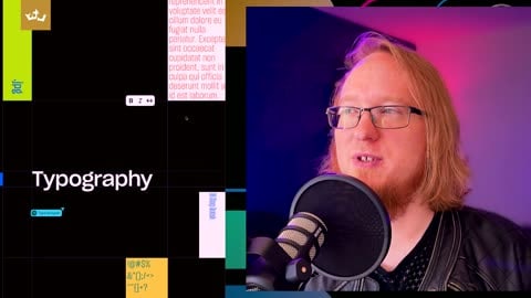
13:44 illustrations, logos, language, we just talked about that. And then if I zoom out, you see that now you have this beautiful array of, uh, things that we can go into, from framework to voice and tone to logos, typography and emotion to imagery to color to iconography. Um, at the time of this podcast the color button doesn't work, so we're not going to go there. We're going to take a quick jump over to typography, because I feel like that's, see how beautiful that looks, those lines were well chosen. Okay, there's line heights and there's x heights and y heights, there's, there's just great, just the animation that we just hope. The grid on top of the typography shows that they know typography.
14:44 and purchase a license to use most fonts, especially if you use, um, I mean if you use a Typekit font from Adobe, your Adobe license covers it for the use and solely for the use of art created while you have a subscription. You can't reuse that font. In fact, they may, they put some digital stuff into there, so if you unsubscribe or you delete the Adobe application, the fonts actually get removed. So if you depend on those fonts and other applications like ProPresenter, if you're a church, um, or using it for computer graphics, if you're putting it in Word, if you're putting it in design, well, InDesign's an Adobe product, but if you're putting it in other products, Pages, etc., or you're trying to use it online and you unsubscribe, you're going to lose access to that font, and it's just going to be gone, and sometimes the font file will just be deleted. Always better for me to advise you not to use a subscription-based font. I don't advise anyone to do, especially if you have multiple designers, because then you have to pay for that subscription for all multiple people as opposed to having a file
15:46 that you can keep with your brand guide, people can install, and it's consistent. Pay for the license, preferably pay for a sweeping blanket license if you can. If you can't, try to hone down what the license is going to be used for, that kind of thing. But in Dropbox's case, they did something very, very interesting. Okay, "Type is what meaning looks like." That's, that's interesting, it's a nice little quote. And here they have the instruction of, this is 120 percent, so they're starting to give you some foundation while you read it.
16:49 right. So we have, uh, they call the Dropbox Sharp Grotesque, and so you have contrast here, you have different width and height that can change with the fonts, so that they can try different, they're skinny, skinny fonts, heavy-weighted fonts, and different heights and different variations, so they can have creative typography, but it's still the same font. You still look at that font, you're like, that's the Dropbox font. And so that change with the height. And then here's some more, um, informative examples of it. Here's the wide font, and of course, oh look, you have sliders, you can change how the sliders look, and you can see how italicized it is, and you can change the width of them, and so you can see how they fill and how skinny they are and how that changes, and then you can change how bold they are, right? So you can have an example of what might work and what might not work, and a little randomize button so that you can see each character, what it might look like, and find out what the best is. The goal here is to give
17:53 the designers a huge typeset. I had a client that actually needed more than the traditional two or three fonts. Okay, and I had to give them seven fonts, because they needed, and they had different use cases. They needed fonts that would help inform them, help them be creative while both being corporate and be, so they needed playful fonts and serifs, and you get sans serifs, the combination of the two, and find the right ones that would work together. And we found seven of them that you look at it, you'd be like, that's, that's that client's, that's definitely 100 percent that client's. And we informed the decision based off of the historical, from, because they had purchased, um, another company many, many years ago, and they had pulled them in, and they didn't want that company to feel left out. So we took information from that company, we took information from the larger company, and we said, okay, we're going to make some design
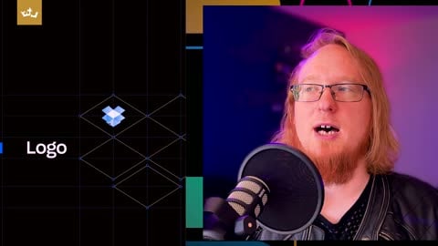
18:54 decisions where you have a little bit of here, a little bit here, so that we, the, the family that's still involved in the other company still felt connected, and employees still felt connected, and they felt like they were integrated and not consumed, if that makes sense. And that's, that leads us directly into corporate culture, but before we do that, let's go back here. If I scroll way back down here. Okay, so let's go to logo. We all are familiar with logos. Um, the Dropbox logo, while it may look, here's a Dropbox logo over years, you know, very gradients, and then you had, oh my dear Lord Jesus, oh, that's a lot of glow, and then, and then you had the normal Dropbox vector logo, and of course in this case it looks way more like a box, and then they had an actual designer design it, and now here's literally squares, tiled squares, isomorphic squares. "Our logo is the most instantly recognizable symbol of the band
19:56 brand." They can put that anywhere, and you know that's a Dropbox link. Okay, Dropbox logo has two expressions, the full logo, which is, so this type of logo is both a brand mark and, uh, text typography logo, so it's, it's a text mark, brand mark, and a text mark combined. And here they show you how to use it. Here's the glyph, here's a watermark, here's the logo, and they're showing you the proper spacing of it so that you can see the logo. The logo is a little bit higher, it's usually generally rule of thumb 120, sometimes 130, 140 percent bigger than the text next to it, depending on the font, right? And it shows how it should be, where it should be used.
20:58 layout orientates from it." Okay, the tab being the logo in something like a box, so there it is, and you see it being used in the corners or in the center. We've already seen the logo used, and it's used very tastefully. It can be small, but it's there. So a logo doesn't need to be large and in your face, it just needs to be tasteful and surrounded with negative spacing. So in this example you have a Dropbox logo in the center, right, and you have all this negative spacing that keeps the text, and your message is "keep your files safe." That's the message of this text here, and that's what you want to see. And then secondary, you see the Dropbox logo, and then it's a Dropbox logo up top, and then it's the word mark on the bottom, and, or the Dropbox in the center of the image, and you have the image on top. It's a little bit creative because you're trying to describe this ethereal thing of keeping your files safe, so they chose a cool image and they put a right-click menu on it, so it's like edit, copy link
22:00 so they can kind of showcase a little bit of what Dropbox does, while both being tasteful and modern. Just increasing the size of a logo is not going to convey your message. Logo with proper negative spacing, white spacing, etc. Negative spacing does not need to be just, you know, white spacing, spacing can be any color, but it, anyway, you've got proper proportioning, and you can see, oh, that's logo, first thing I see was the Dropbox logo. It's great, keep your files safe, great, it's doing what it needs to do without it being in my face.
23:04 inform these decisions so that you can make better decisions when you're doing user interface design and user experience design, because remember, their whole line of business is a web service. Okay, so if your line of business is, um, you have merch, then you're going to have one that shows how you use proper packaging, where you put the UPC, where you put all the stuff that you need, and all the information, the nutrition label, and all the fonts and all these kinds of things, and the style that you're going to have when you wrap the product label around the bottle or whatever it is you make. This information is specific to your business, to your line of business, and is specific but informed by the message you want to transact. And so they want to transact that using, Dropbox is easy and simple, we're taking a very complex idea, sharing files, and making it simple. Okay, and so, you know, "our icons and typography speak the same language," and they say that because they'll use letters and components to help inform the width
24:05 and the height of the icons, and the idea is the iconography is the same as the fonts, so it feels right in there with the Dropbox Grotesque font and it feels connected. It's the same weight, same thickness, and same adjustability, but it's consistent, so if you look at an icon it should make you think of the Dropbox font. Remember, consistency in message. Okay, and then we have some examples of the font, so we have spot icons, 120 by 120, and we have 64 by 64 pictographs, and then of course we have the standard 24 tooltip. By the way, all these icons, you bet they're SVGs, they're vectorized, they're not JPEGs or Photoshop files, they're definitely made in Illustrator or some sort of vector, uh, program. Okay, so "icons visually support our brand across the interface," and here we got some example of how it does. And then of
25:05 course, that's it. Now that they talk about imagery, they talk about voice and tone, and they go through their details of how Dropbox strives to look and feel and function, consistency in message. Look, so if you look, this is all creative, they have different colors they use, they have different images they use, but how they apply this informs their decisions. Okay, everything is consistent, their whole message is bred for one purpose in mind, consistency and message, and to help inform and provide a resource for their designers. Okay, so we're going to step into corporate culture, because Dropbox is using the brand guide to also talk about corporate culture, although we're going to switch over to Cash App because they have a very interesting culture, um, at least conveyed by the imagery that they manufacture. So corporate culture tells your team how to communicate the message. So now you have
26:06 guidelines to use your word mark, your icons, your logos, your typography, your fonts, maybe you have colors in there, all those kinds of things, right, to form a base of brand guideline. But then you're going to step out and you're going to show your corporate culture. I have a bank client, they have this full and detailed pages and pages and pages: here's the imagery you use, because we want people to be smiling, and we want people to be this, and we want people to be diverse, and we don't want to show this, we don't want to show this, which is, so they can help hone in the creative so they could take less, you have the name to think strategically, we've done a strategic thing for you. And they've developed this brand guideline internally, right, with some help from people like me, and they've developed this brand guideline, and they developed it versions, versions, versions, versions, iterations, iterations, iterations, try to hone that message, make it easier. And now they're like version three, four, six, something, anyway, it's, it's a long version number, but it's built over years and years and years, and they're honing in, they're honing in,
27:09 they're dialing in to their customers and dialing, how do we speak to our customers, how do we transact our message, because we want you to know that we're available to you, we're local, we're here, we're ready for you. Then, you know, we have a message we want to translate. Now I, I have to, like, filter everything I say, because a lot of my clients have non-disclosure agreements, so I'm like protecting them, so I can't say specifics, but know that their whole brand guide, you know, some people have a brand guide that's like 10 pages, great. This company has a brand guide that's like 75, they look like slides, and they just go, go, go, go. And if I ever have a question, or if there's a concern, or the designer that has a question or concern, or if I get a piece of art, I'm like, no, no, no, no, the brand guide says this, redo. They can go back to this document and inform their decisions, and it's designed to be easy to read. Everything is, so there used to be, a whole long time ago there used to be, throw drop shadows, glows, throw all sorts of stuff on your, your videos, your art, your, throw a bunch of copy on
28:16 it. No, no, no, no, no, no. People, it's not that people don't like to read, it's that when people read something short and small, it leaves an impression, and especially when it's well created and well crafted. Okay, and remember, less is more. Negative spacing helps people's brains decompress from stress, and we live in an environment, in a world, especially after COVID, that everyone is stressed out. So anything you can do as a designer to inform those decisions, to expand those decisions, to help people, help your customers breathe and feel your emotion, whatever that is, the emotion of Dropbox, the emotion of Cash App, the emotion of The Universe. Okay, so your corporate culture is designed to inspire, not constrain. Okay, a corporate culture document in your brand guideline, a culture document or informative components in your brand guideline that inform the culture, are not supposed to be a list of don'ts.
29:19 Boundaries are not designed to stifle you, they're designed to prevent you from harm. The road barriers, very simple, if you're going to go and fall asleep at the wheel and turn left, you're going to hit a road barrier as opposed to falling off a cliff and dying. Okay, um, Proverbs 29:18, "Where there is no vision, no revolution, no revolution of God and his word," and you can equate this to your brand. If there's no understanding of what you're doing, if it's not a vision, there's no purpose, it's not written down, no one knows what to do. Okay, that people are unrestrained. Okay, run wild, die, do you make stupid decisions. Lack of knowledge, people are destroyed. Okay, we want to, uh, as a minister I want to keep the law of God, I want to help teach people how to keep the law of God. A law of God is not about a list of do's and don'ts, it's about to live as Christ designed us to, to become our, for lack of a better word, our perfect
30:27 self, our godly self, our holy self, our pure self. We can't do a list of things. Now human beings, such as other preachers, priests, etc., have added and created a whole list of unspoken rules that are not listed in the Word, okay, a lot of them, and they make those things doctrine, so they can kind of, that they want to add to you. But no, no, no, you don't want to create a brand guideline that's, you know, 300 pages long. That's terrible. I mean, someone's spending more time flipping through the brand guideline than executing the art and designing. You don't want that. You want to provide, here's the guideline, here's the news, and we see that these things don't work, and here's why. Here's why we chose a typography, you know, they chose iconography, icons help convey complex ideas, and we want it to look consistent
31:29 with our font that we had designed, that allows us to do variants and allows us to be creative. Okay, great, great, that's easy. Don't over-constrain people. If you own a business, you know how much you're paying the government, and it's, here's the employee amount, and then here's your amount as business, and you're like, this is double tipping, this, the feeling and the experience with doing taxes is, I get no real benefit from being a citizen of the United States, and therefore it makes no sense for me to be shelling all this money, you guys have debt, blah blah blah, right? That's the feeling, that's the experience that happens, because IRS tax code is unknowable. It's extremely complicated because people who put the tax code in there want to prevent themselves from having to pay too much in taxes, and then they also want to make sure they get a lot of people taxes, and they want to keep the middle class the middle class, and I want them to jump over to all those kinds of things. I'm not being a conspiracy, all I'm saying is too much over
32:31 regulation can stifle creativity, but the right amount. Love your neighbor as yourself, it's Jesus Christ, love your neighbor as yourself, and love, oh, love God with all your heart, mind, and soul. Those are commandments, that's it. All commandments are done to those two rules. If I do something and that's showing my brother or making him stumble, okay, that's not me loving my brother like myself. Okay, so I could change that, that's not me loving God if I fall, find myself into sin or something, maybe that's not me loving. The difference is the regulation or the guideline is small, it's attainable. That's what you want for your brand guidelines.
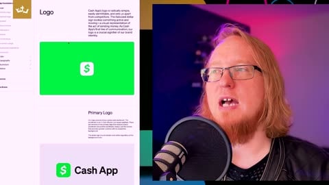
33:37 Cash App symbol, very simplicity. When you choose a logo, when we'll cover this, when you choose a logo, choose simplicity. Vectorized logos work 10 times better than having an over-gradient Photoshop logo that doesn't convey the message, because once you're consistent, like here, we'll scroll to another one here, and you see there, there's that logo. Okay, but it's, it's green, and oh, here's one that looks like it's in a credit card prism or something, and you can be creative with the brand mark. There you go, there's the animations, and you can be as creative as you want because you have this attainable guide, this logo, and you can do anything you want with it. It's cool, especially with this corporate culture, they're all about breaking the status quo, being very creative, trying something new. Can we go to their voice and tone, um, I, this is leaving the fancy web experience, I encourage you to enjoy flipping through and see all
34:42 the illustrations and everything that they did. Um, that's again design.cash.app, but there's a little dot, the top right corner, you click that, it'll take you to here, and it will help you understand their vision. So, "the Cash App's voice brings our brand alive through the words we write and speak. The way we communicate to customers has the power to shape the relationship with money." Okay, "through carefully choosing words, we aim to make money more relatable, instantly available, and universally accessible," like Cash App took banking, Cash App took Bitcoin, took, made it less complicated. Okay, and Cash App works instantly, almost like cash, and that's their voice that they're trying to convey. They want everything they do, everywhere you choose, "we aim to make money more relatable, instantly available, and universally accessible." Okay, and so they show our personality, and they're showing different examples on how to use typography here, right, and they want that, they want you to go
35:43 straight to the point. Okay, so here's, this is cool. So this is what we want you to read, but here are the don'ts. Notice the focus is on what you can do, not what you can't. "We're clear in what we want to say and we stick to it, because we're on a mission to make money universally accessible. That means how we talk about it too. We tear down barriers by breaking down financial lingo. We instill confidence in our customers along with the financial journey by equipping them with the information tools they need." Yeah, this is a little bit, this copy would be a little bit more wordy than, um, Cash App's tone would be, but they're also talking to designers and talking to copywriters and talking to creatives that are dealing with this type of content. And so on the, and they say, okay, we should be clear, focused, organized, curated, confident, and empowering. We shouldn't be sparse, cold, boring, lifeless, dull, vague. Okay, so here, here we go. "Never bury the lead. We always start with the most important information first. We respect your
36:48 audience's limited time and attention. We spend time becoming fluent so we can confidently curate our message." Notice, notice they're not saying that their customers are dumb, they're not. Okay, that's a don't. What they're saying is they know that their customers' attention is valuable and they have limited time, their time is worth money, that's what they're saying. And so they use a little bit less words, they convey their message, and they do things like "build familiarity through consistency and reception. We create a sense of familiarity that depends on a relationship with our customers. We follow established conversationals, both internal and external, so that our experience are easy to recognize
37:48 and use." Yeah, they're kind of use conversational tones, that kind of thing, being approachable, being familiar, which works with them. And then of course that, you know, they have a whole list of tones and things, and then they have some examples on how much to the point something is, how approachable something is, how up front it is, because they don't want to, they don't, Cash App doesn't want to hide that there's regulations they have to do, that you're limited and stuff. They don't want to hide that because they want you to know it up front, unlike banks who are like, here's your transaction fee, here's this fee and that fee, which, because of Cash App and other banks like it, has become less of a real thing, because they're being approachable, they're being up front, they're being to the point, they're being consistent with their message, and this kind of stuff informs their culture. It's the voice and the tone, and this is how the art is created, and, you know, internal art, it makes internal to the company, memos, um, HR guides, employee guides, those kinds of things, uh, documentation, signs that you might have
38:58 everywhere, and externally, so they can be consistent with their customers, they can transact a message to their customers properly. Okay, and remember, and now if we go back to a logo here, it's literally a cash symbol, and then just got rid of it from in the middle of the S because it looks better. That's Cash App. It's not like no part of this logo is going to sing to you that I'm not going to be able to use it like cash. It's very simple, simplicity. So when you build a logo, you design a logo, it's about leaving an imprint, an emotional connection, or using a previous emotional connection, um, to connect it. So the Nike swoosh, you know, was designed, you know, air and jumping, Air Jordan, those kind of thing. So the Nike swoosh is something that we equate to because they built that brand. There's their icon, their brand mark, they built that brand, and it's attached to an emotion now because of all of their
39:58 constant message: just do it, just do it, just do it, just do it, and all the athletes they have and all the major athletes, because they're conveying that message consistently, and that consistency is informing everything they do. Okay, so, and then, you know, it's unique to your story. You build a logo, here's a Cash App logo, we just saw the Dropbox logo, right? So you build a logo very compressed, very simplicity, it's a drop and it's a box, drop your files in the Dropbox, very easy, very simple, simplicity, simplicity, people. Okay, um, Cash App is the Cash App logo, so much talks about the message, vectorized and simplicity helps you grow and have options, which you can see all of the wonderful thousands of things that Cash App has here. Here we'll just look at a few more of them here, and look at that, and we'll go back to the grid view here, and boom, you've got illustrated
41:00 art and you have 3D art and you have Bitcoin and you have imagery and graphics, and I love, I love going through this because it looks like it creates its own art when you scroll through it. Look at that. Okay, it's just, it's just, they're just informing everything they do with their brand and their guidelines, and they're just helping you. That's their culture, that's who they are, and you wouldn't expect that by Cash App, and you go in and you see all these wonderful things, and you're seeing all the possibilities that Cash App has because their guides are specific, very specific. You just sold that, we just read the message in tones, and it's cross, but it's not over-constraining, it lets the creative be creative in the boundaries because they have this box now that they're now informed about.
42:01 logo, you can't just copy and paste it. You can be informed by it, you can use it as a creative asset that you put into your list of things, and you can draw with it and use it, you know, get some concepts and ideas from it, but make a unique logo for you. Okay, have someone design your unique logo, don't steal someone's trademark. Um, also don't confuse your customers, don't change your message, choose your message, stay consistent. If your vision improves, then improve your mission, your message, improve it, don't forsake your previous, um, your customers can be easily confused if you change your logo randomly, if you change your typography randomly. Remember, they're going to start associating a feeling with your brand, with your social media account, with your website, with your location, and when you make drastic changes, that they're going to come in, they're going to feel a little bit betrayed, they're going to feel a little bit of an emotional response, could be positive, could be negative, but you have to be
43:04 careful about overly rebranding and overly changing and transforming your logo and making different changes. A consistent message is going to go a long way to establish credibility and authenticity and breed loyal customers, creating loyal customers. Okay, so don't change your foundations, rebrand, become more than you were yesterday while keeping the message consistent, like I said, being formed, the legacy of the, of the history to create something modern today. It doesn't have to look like yesterday, but being informed by why you made those decisions, and then I creatively defend yourself in that brand guidelines, this is why we chose it, this is why we chose this logo. Giving people that reason why is going to help them informed and make informed decisions, it's going to help them communicate the message consistency that conveys to the customer the trustworthiness and the authenticity that they have
44:08 with what the message you're conveying. Cash App, we're simple, you can transact your cash and it's universally accessible. Dropbox, drop your files in a simple and easy to use form as opposed to FTP and SSH and all these different things that you could do. Here's the interface: upload, send link, copy, paste, very simple, very easy to go. Now Dropbox has consumed a lot of features, and some features may be a little bit less user stability because they are trying to sell this feature versus that feature, and, you know, that kind of thing, but all of the decisions are informed based off the simplicity of transacting that message. You have "keep your files securely right here," simple, right? Okay, um, if you haven't already, like, share, comment, subscribe, let everyone know that this great podcast is here for you. Also, if you need a brand redesigned, a rethought, or replot, and because you want to establish a new message, or maybe you're
45:12 doing a new line of business, look us up, EGTUniverse.com. We do everything from print to commercials to website design, all inspired by The Universe platform and all that kind of things. So look us up, EGT, that's every good thing universe.com, EGT, um, entertainment, gaming, technology, uh, EGTUniverse.com. Anyway, I'm Justin Kazmierczak. Let me pray you out before we go.
46:13 time right here on the Create Podcast, you